The brief
Disro came to me at founding stage — a clear product vision, a sharp team, and no visual identity whatsoever. The challenge was to establish a brand that could carry the company from early-stage to credible SaaS product: modern, distinctive, and built to scale across marketing, product, and external communications.
The brand needed to feel native to the Shopify ecosystem without being derivative of it, and the product interface needed to match the ambition of the underlying technology — AI-native tooling for e-commerce operators who move fast.
Brand identity
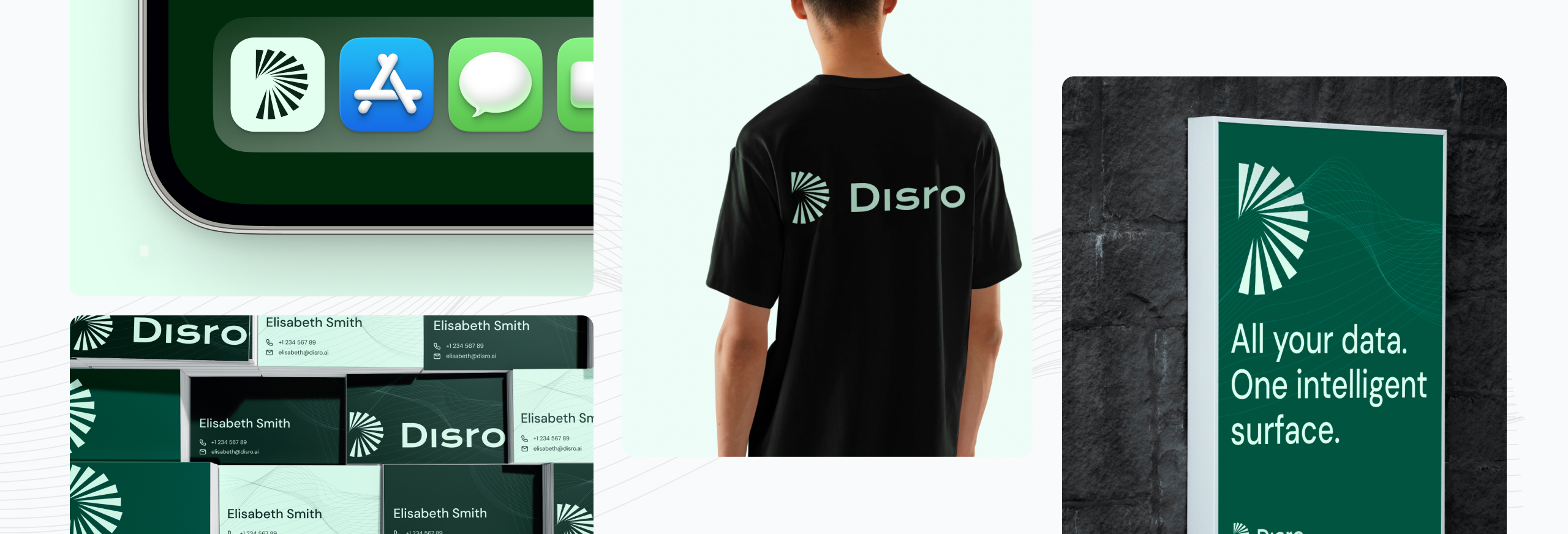
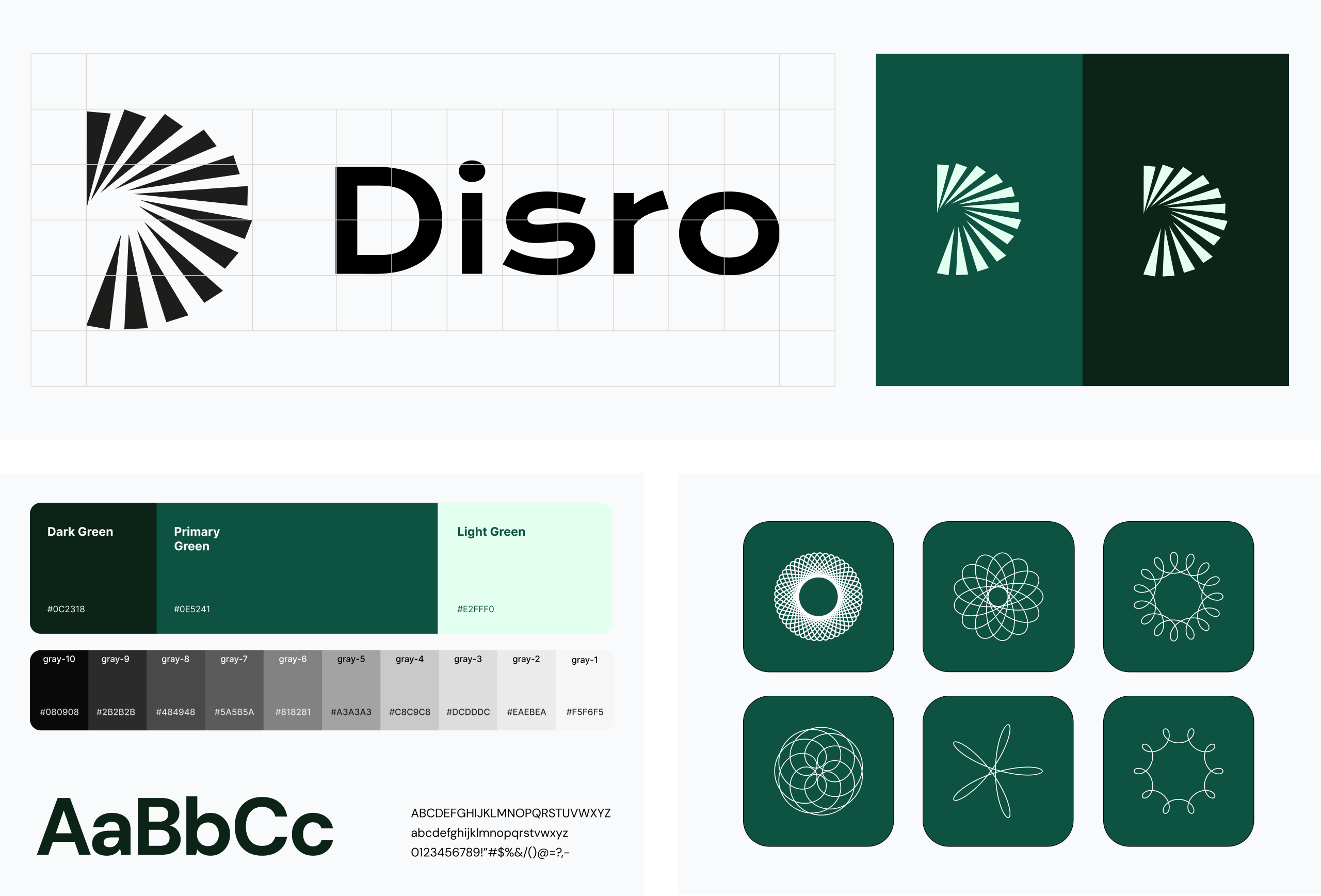
I built the Disro brand from scratch: naming-adjacent visual language, logo system, colour palette, typography, and the foundational rules that would govern how the brand looked across every surface.
Key contributions
• Designed the logo and core mark from scratch
• Defined the full visual identity system — colour, typography, layout principles
• Established brand guidelines for use across marketing, product, and external channels
• Created a scalable asset library for ongoing team use
Outcome
The brand gave Disro a coherent, credible identity at the earliest stage of the company — a foundation that could be applied consistently across the website, the product, sales decks, and investor materials, without needing to revisit first principles each time.
Website design
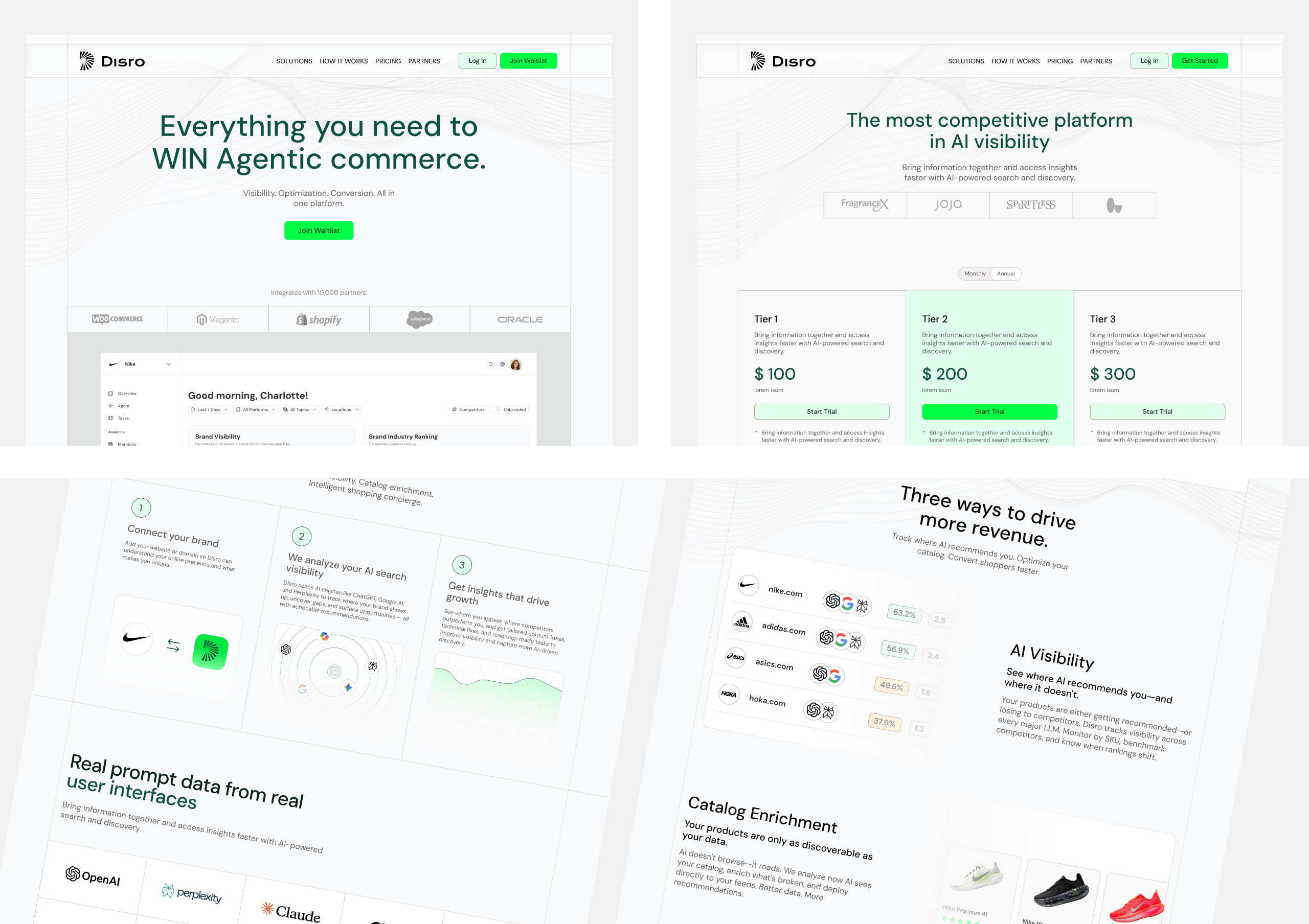
With the brand in place, I designed the full marketing website — homepage, core landing pages, and conversion-focused campaign pages. The site needed to communicate product value quickly to an audience of growth-minded Shopify operators, while positioning Disro as a serious player in a competitive space.
Key contributions
• Designed the homepage and all core marketing pages
• Structured page hierarchy and information architecture
• Created wireframes and high-fidelity page layouts aligned with the brand system
• Designed conversion-focused landing pages for acquisition campaigns
Outcome
The website established Disro as a credible SaaS product from day one, clearly communicating product value and creating a strong platform for growth and investor conversations.
Product UI
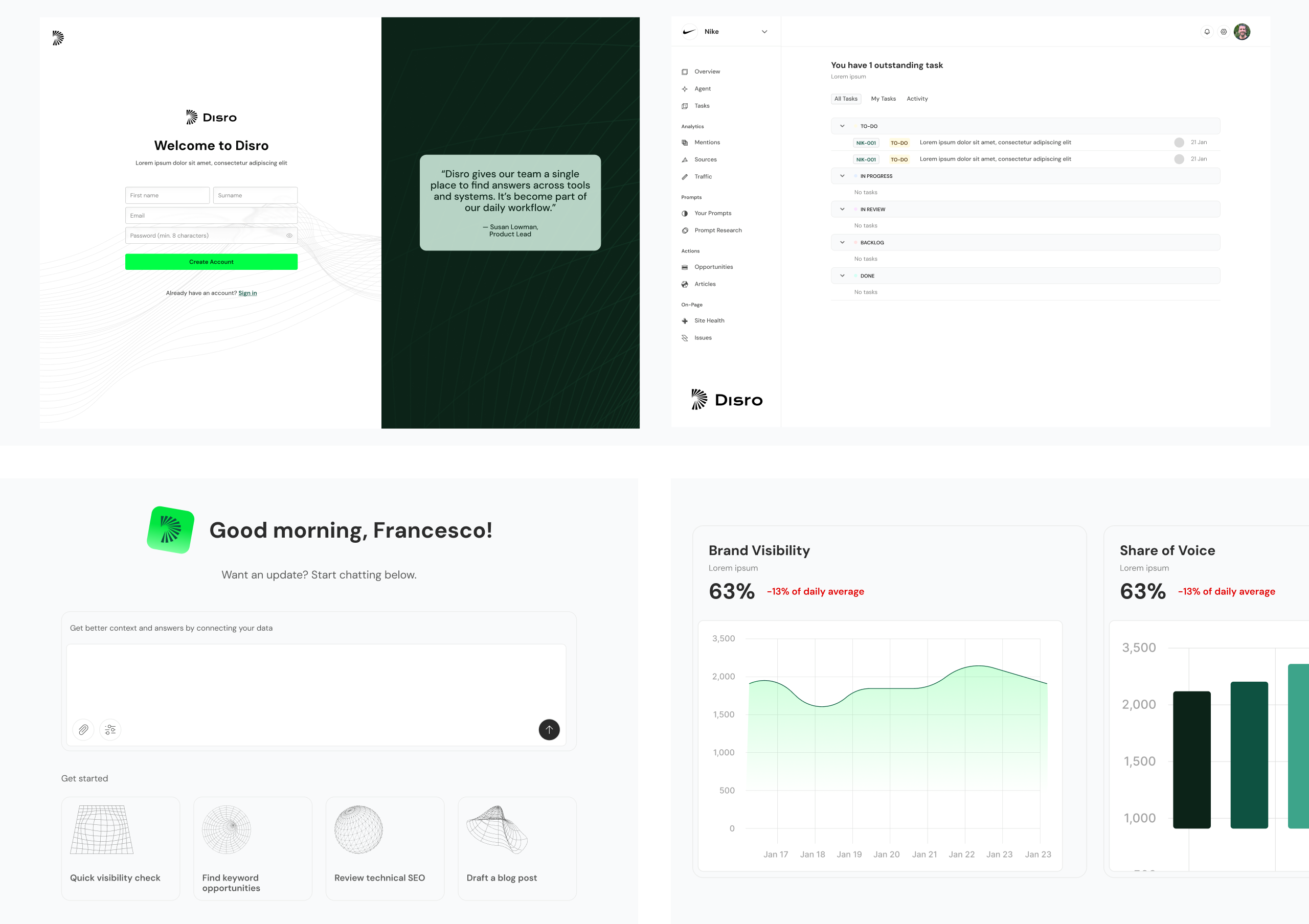
The final phase of the engagement was a full visual design pass on the product interface. Working from existing wireframes and flows, I translated the brand language into a coherent, functional product UI — refining typography, colour usage, component styling, and layout hierarchy throughout.
My scope was visual design rather than UX or interaction design: taking the established flows and ensuring the product felt as considered as the marketing, while defining reusable visual patterns that could scale with the interface over time.
Key contributions
• Full visual design of the product interface working from wireframes
• Applied brand system to product components — typography, colour, iconography
• Defined reusable UI patterns and component library foundationsImproved hierarchy, readability, and visual consistency across all screens
Key contributions
The result was a product interface that felt clearly connected to the broader brand — polished, consistent, and ready for the next phase of development. The visual patterns established during this work provided the team with a foundation they could build on without revisiting design fundamentals from scratch.
The live Disro website no longer reflects this design work — the company has since pivoted and replaced the site with an email collection page. All visuals shown here are from the original design files and are shared as portfolio documentation of the work completed.